
SZapp - Mobile Communication App
Streamlining communication between Schools and Parents
SZapp is positioned as a communications tool that a School can utilise to communicate quickly to parents. Its initial concept was developed prior to my employment at the company to be a small platform that allowed the customer to send push notifications to parents via Schoolzine’s proprietary content management system along with another avenue for users to deliver their weekly School.
Project Overview
Due to upcoming (at the time) depreciation in code basis required for mobile applications, SZapp was to be redeveloped using Flutter. With this redevelopment came the initiation of the expansion of the utilities and capabilities of the current app. Due to budgetary constraints, these changes were to occur over several iterations of development. The case study presented shows the process around stage 1 of the redevelopment.
Additional functionalities initially requested by C-Suite
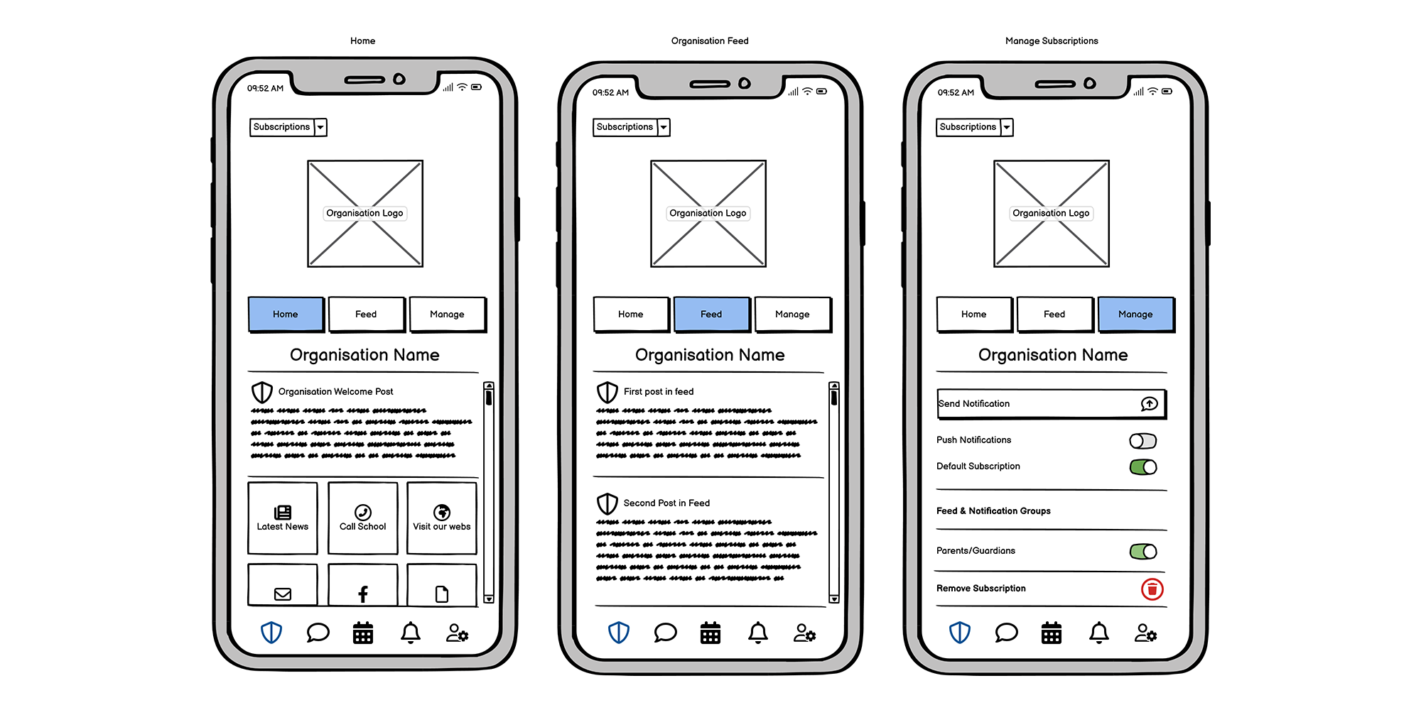
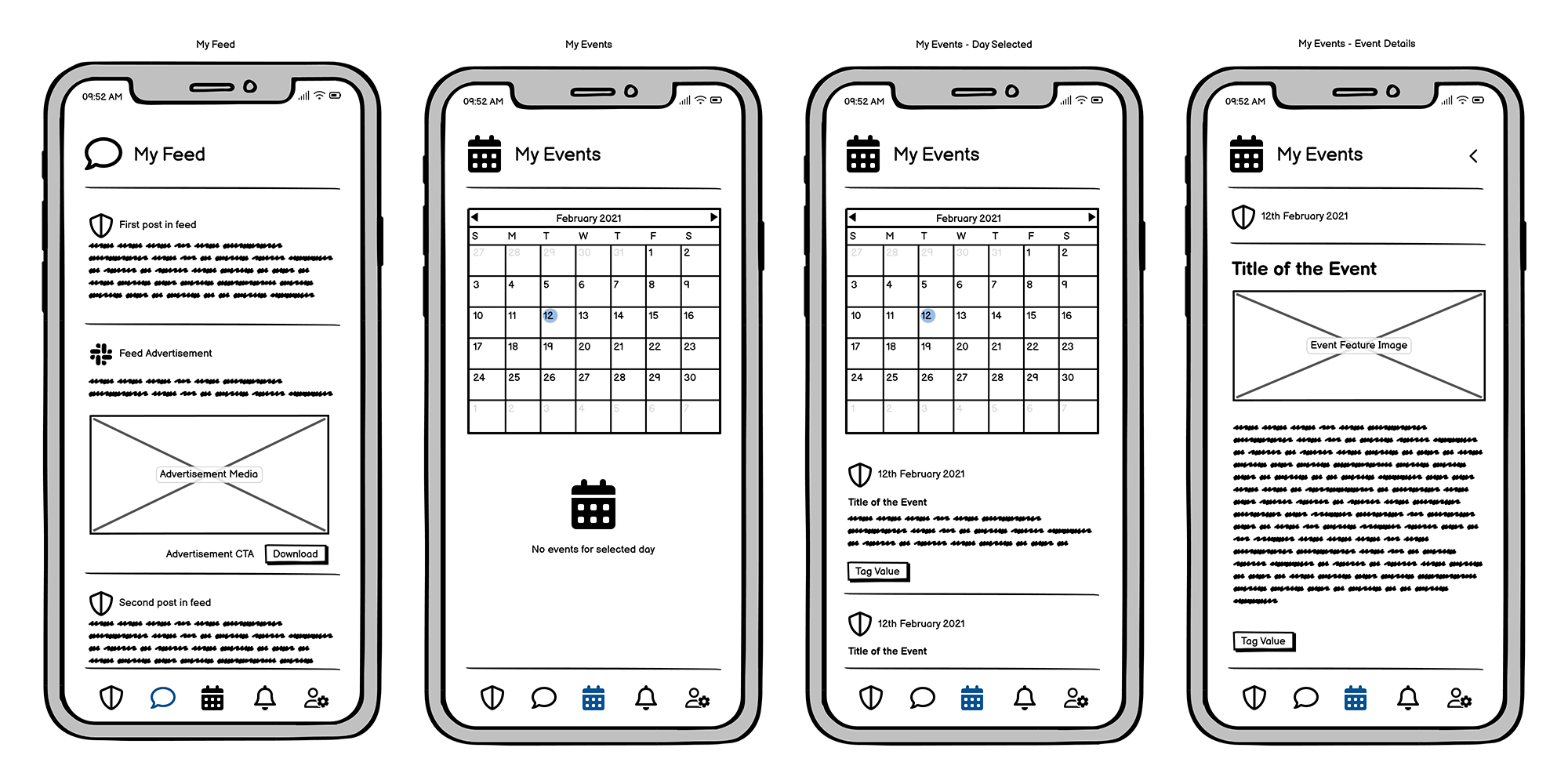
Two News Feeds
Events Calendar
Separate Notifications Listings
User Chat
Problems
C-Suite executives were adamant on keeping the original app’s design while enhancing its functionality.
Existing app had push notifications feeding into the general school feed, which led to a mess, and potentially missed messages.
No understanding of how the user was using the original app
Proposed Solutions
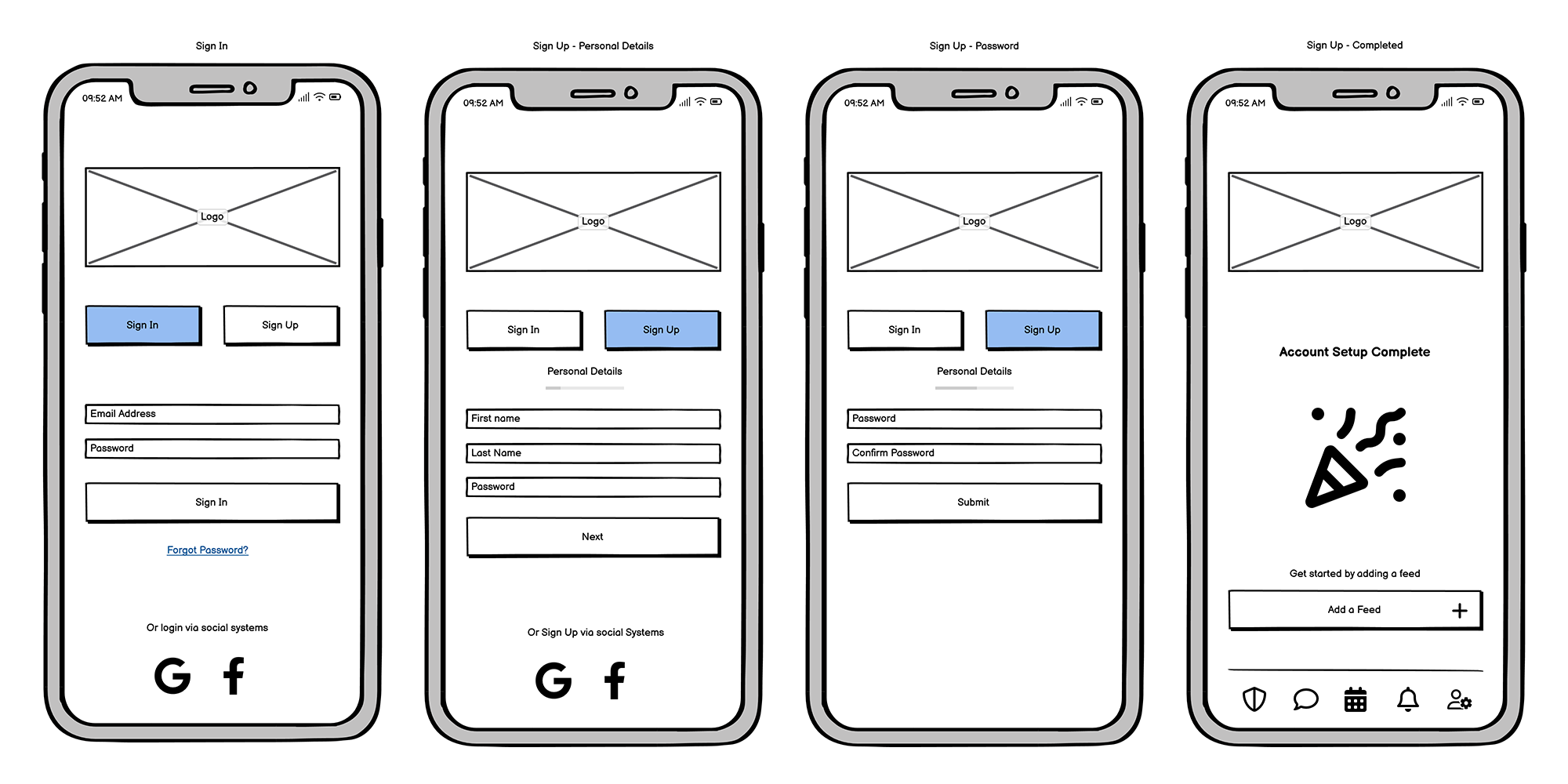
Develop primary and secondary navigations.
Separated notification listing
A combination of user surveys, customer surveys and One on one interviews with a selection of customers would be conducted.
Role:
User Experience Designer
User Interface Designer
Visual Designer
UX/UI Design:
Competitive analysis
User surveys and one-on-one interviews
Personas
Task flows
Site map
Low-fidelity wireframes
High-fidelity mockups and prototypes
Design system and UI kit
Usability tests and findings
Project Specifications:
Tools:
Adobe XD
Photoshop
Illustrator
Balsamiq
InDesign
Draw.io
Research
Primary research was conducted with user and customer surveys, followed by one on one interviews with individuals from both factions. Additional secondary information was collated from Schoolzine’s Sales, Marketing and Customer Support teams who had insights into users through their day to day activities.
Additional research was conducted with an understanding what functionalities, features and user interfaces primary and secondary competition was utilised within their own mobile applications.
Findings
Majority users had multiple children within one school. Those with two schools, unexpectedly, had a child in primary school and the other in high school (which we identified and passed onto the sales and marketing teams as a potential selling point for primary and secondary schools close to each other).
Around 75% of users were confident in adapting to application navigation changes, while majority customers (those that pay for the software subscription) of Schoolzine were opposed to radical changes to the current app navigation fearing user confusion, which would lead to inbound communications to users.
74% were comfortable with downloading a new version of the app, requiring the previous version to be manually deleted, though a large proportion would be unhappy about doing so (this became relevant in the marketing and support documentation required to be supplied to customers).
68% of app users wanted to have additional information about their child's day to day activities within the classroom.
Users and customers were curious about the chat functionality, but 62% of the customer base wasn’t sure on how it was going to be utilised by the school. This, among other factors that included budget and development times, led to the decision to remove the functionality from this version of the app.
User and Customer Personas
There was a strong dichotomy between users of the app and Schoolzine’s customers. Additionally, within school administration, there was a dichotomy again. Therefore, we broke down the users into two personas (a mother and a father) and customers into two personas (two school administrators of different ages). Ultimately, these personas helped guide internal company stakeholders to make formal decisions about the types of functionality that would be included in the app, not just in phase one, but in future phases.


User task flows
We identified two primary task flows for the user to complete. A brand new user that encompasses the journey from downloading the app, to adding their School’s feed and the existing user. I identified the true simplicity of the user’s journey once all of their schools had been added to the app, therefore putting even more importance on this functionality.


Site Mapping
In addition to the task flows, the site map identified the key areas that required an extensive detailing during the high quality design pass: 1. User Registration, 2. School Management, 3. User management. The utilisation of these two elements was key in designing the new mobile app.
Sketching and prototyping
Utilising research from competitive apps, the current version of the Schoolzine app and the research above gave me the landscape of the initial decisions required for the designs of the app. My sketching included the navigational changes that would occur when a user would swipe from left to right depending on what screen they were on. Sketching does give me a rough sense of where buttons and other contact points go, however these have a closer place to home in the low-fidelity designs.
High Quality Design
We presented the high quality designs to a select group of internal stakeholders, users and customers. While registration, user management were different, as the core functionality of adding a school and the initial landing page and news feed remained the same, therefore the adoption of new navigation structures was accepted. Users and customers alike queried additional functions that could potentially come in the future, raising several suggestions such as class specific news feeds with teacher access to updates with comments.
Note: This file doesn’t contain all components designed.

Improvements
As this was phase one of the redesign of the app, there are notable improvements that can be made in the next iterations of the app.
Escaping the requirements potentially confusing navigation. While customers made note that they are apprehensive regarding changes to the navigation pieces from the previous app addition, utilising the existing navigation while introducing a new one was shown to be confusing to some new users. Adoption of a burger menu in the top left is a potential solution to include the subscriptions area. Additionally, the school buttons for Home, Feed and Manage can occupy space next to the burger menu in the form of a dropdown to save space, still utilising the side scrolling to navigate to each page.
In addition, a new user tour function can be developed to help guide users on any changes to navigation. If navigation also follows structures that are persistent in many apps globally this knowledge of navigation will be transferred to the app's user.
Enhanced ability for customers to utilise app updates via the app directly rather than funnel through content management system, including parent specific updates or requests.
Rearrange and reduce visual noise.
Lessons from the Project
Unlike other projects from Schoolzine, the customer and user were separate entities with different objectives. The dichotomy of users showed that the majority of users were comfortable with change, while the customers were concerned with the rise in work as a result.
Sometimes, we have to work with the best that the budget and timeframes allow. These constraints will have an impact on the user’s experience, and we as designers must as best we can, design with those impacts in mind.